Music Festival Website Partial Redesign & Maintenance
Project Overview
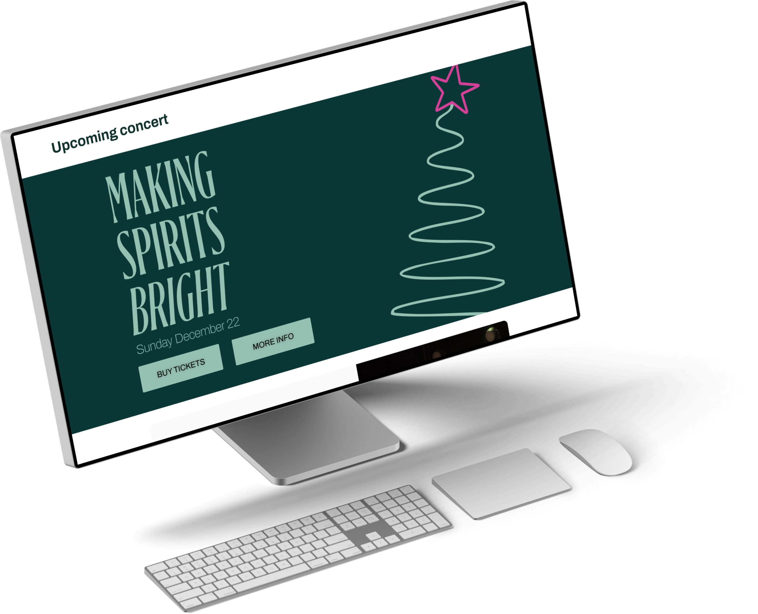
The partial redesign involved close collaboration with the client, focusing on improving user experience and accessibility through updates such as a refreshed homepage, streamlined navigation, a media page, and enhanced inclusivity features.
The problem:
Outdated design and complicated navigation issues created a poor user experience. The bland color scheme resulted in a lack of contrast, further diminishing usability.
The goal:
Improve navigation, enhance functionality, and boost accessibility.
Role:
UX Designer / Web Developer
Responsibilities:
Prototyping
Homepage & navigation updates
Accessibility improvements
Facilitating regular client feedback sessions to align designs with business goals
Ongoing maintenance

User research: pain points
1. Navigation Challenges:
Users struggled to find relevant information due to a cluttered and confusing navigation structure.
2. Accessibility Issues
InSufficient contrast due to brand color alignment, hindering accessibility for visually impaired users.
Sitemap

Accessibility considerations
Color
Ensured all colors met accessibility standards by using a contrast grid, testing combinations to improve readability for all users.

Cognitive load
The original header included too many pages. Reduced cognitive load by simplifying the navigation structure for easier use.

High-fidelity prototype
Implement
For this project, I used WordPress as the platform along with multiple plugins, such as Elementor, to build a responsive and visually appealing design.
When required, I implemented custom CSS and HTML to enhance functionality, refine layouts, and achieve certain custom features not included in the default plugin options, ensuring a user-friendly experience.


Maintenance
Site Migration
Successfully led an end-to-end site migration (April 2026), managing database and DNS configurations to enhance server performance and stability.
Data-Driven Updates
Achieved a 72% increase in page per session rate, and 15% increase in scroll depth through UI/UX redesigns, translating GA4/Clarity behavioral insights into iterative design refinements.


Takeaways
The Importance of Accessibility: Testing colors in a contrast grid and implementing high-contrast modes highlighted the significance of designing for inclusivity.
Streamlined User Experience: Simplifying the navigation structure greatly improved usability and reduced cognitive load for users.
Iterative Design Process: Regular feedback and testing ensured the final design met user needs effectively and aligned with accessibility standards.
Collaboration and Communication: Working closely with stakeholders emphasized the value of clear communication to achieve design goals.
My works
Explore my UX design journey. Each project showcases my passion for creating intuitive and engaging user experiences through thoughtful research and innovative design.


-
A responsive website automatically adapts to various screen sizes.

-
A visually impaired-friendly website for a non-profit organization, featuring built-in accessibility tools.

-
Coming soon